


hello@clarkandwaugh.com
MicroPads
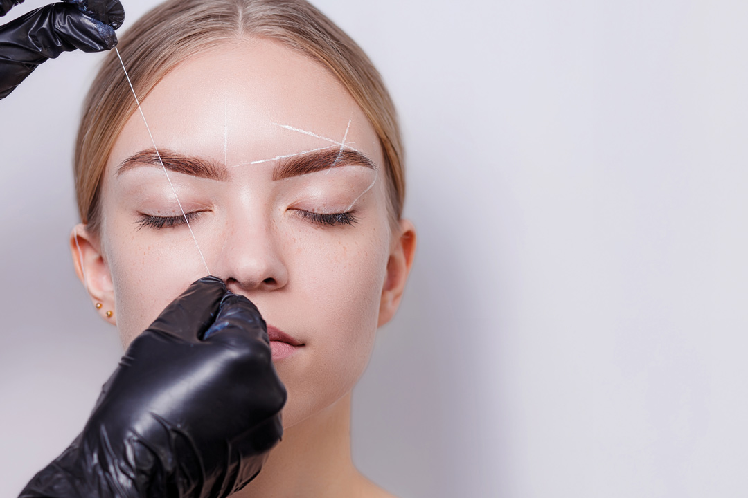
MicroPads is a category-defining brand developed to revolutionise practical learning in the tattoo and micropigmentation industries. By creating life-like silicone skins that accurately replicate the realism of actual skin, including variations in thickness, MicroPads provides practitioners with a safe environment to learn, improvement, and trial new techniques.
Practice Makes Perfect
We were engaged to deliver a comprehensive brief: constructing a brand that instills immediate confidence while creating an objective roadmap to transform industry professionals into lifelong brand ambassadors.

The Challenge
Despite rapid evolutionary shifts in the quality of tattoo and micropigmentation artistry, the practice materials available to technicians remained "stuck in the dark ages". The market was saturated with shortcuts and generic copycat products that lacked the realism necessary for high-level training. The founders identified a critical gap: a lack of premium, high-quality training aids that both established and new artists could trust. The challenge was to bridge this gap between technical capability and professional perception, positioning MicroPads as the only credible choice for serious practitioners.
Our Strategic Approach
Our methodology involved a deep-dive into the psychographic decision-making of industry professionals, ensuring every business decision aligned with their fundamental needs and desires. We established a "magic thread" to link all touchpoints, focusing on a tone of honesty, confidence, and innovation. By moving the conversation away from traditional "selling" and toward an educational, supportive partnership, we framed the brand as a "wise friend", a mentor that empowers technicians to develop their craft and reach new professional heights. This approach prioritied the creation of an ownable language designed to inspire passion and long-term loyalty within the community.
The Solution
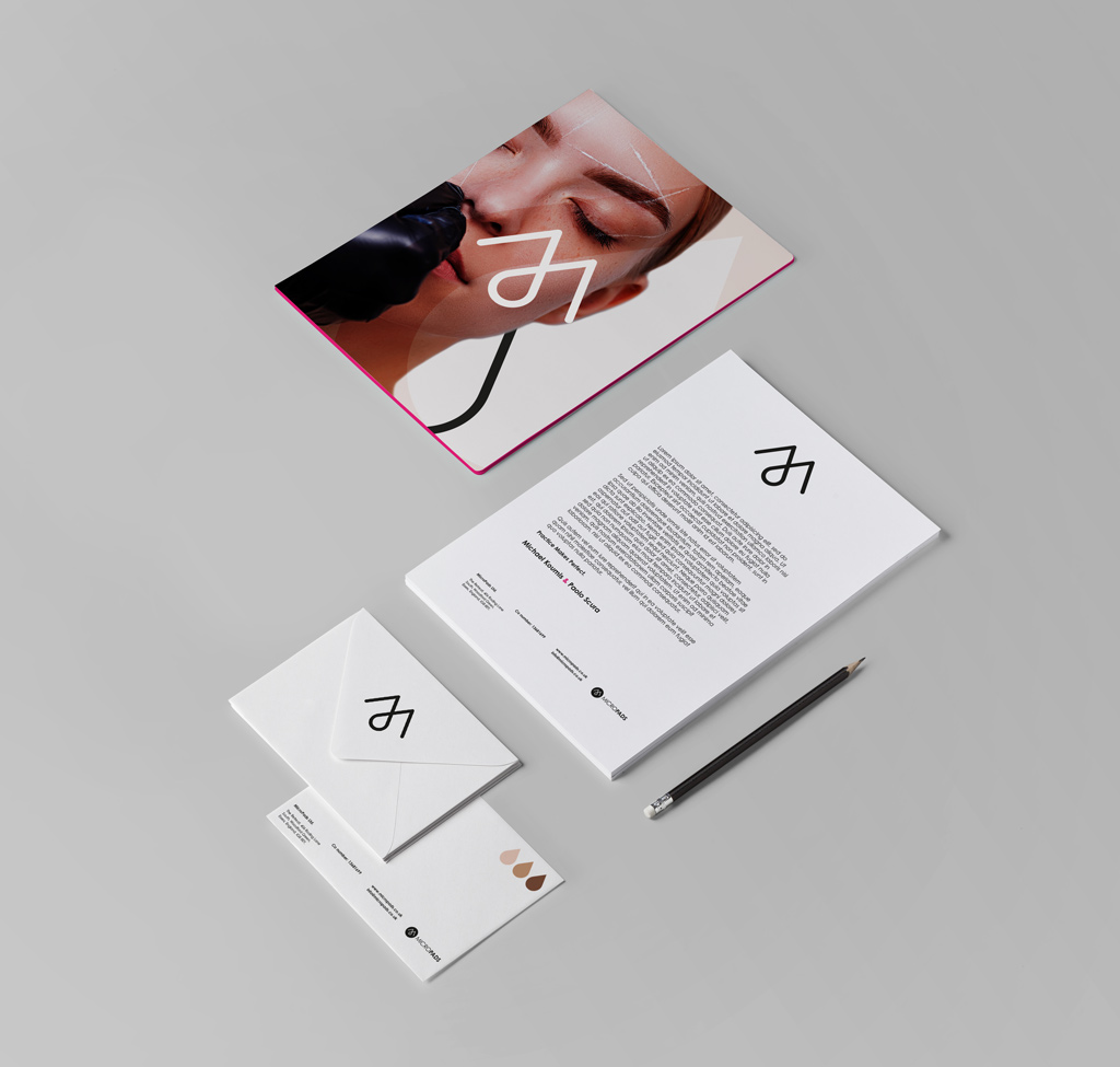
We crafted a modern, professional visual identity and strategic system centered on the concept of "Every Drop of Realism".
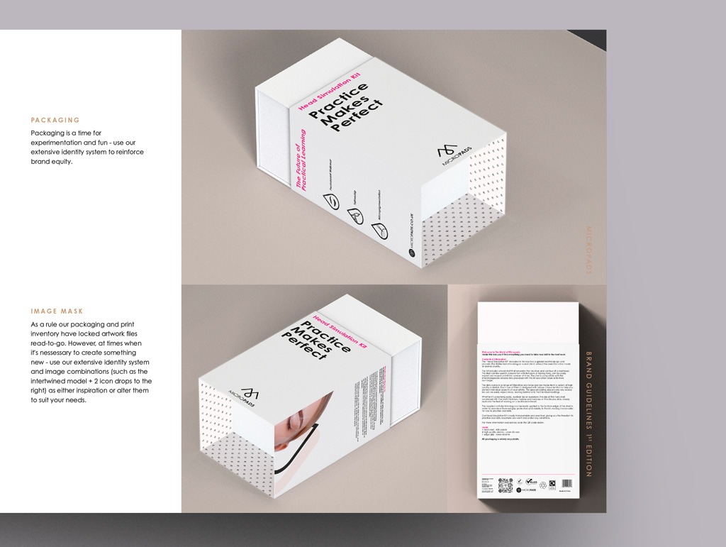
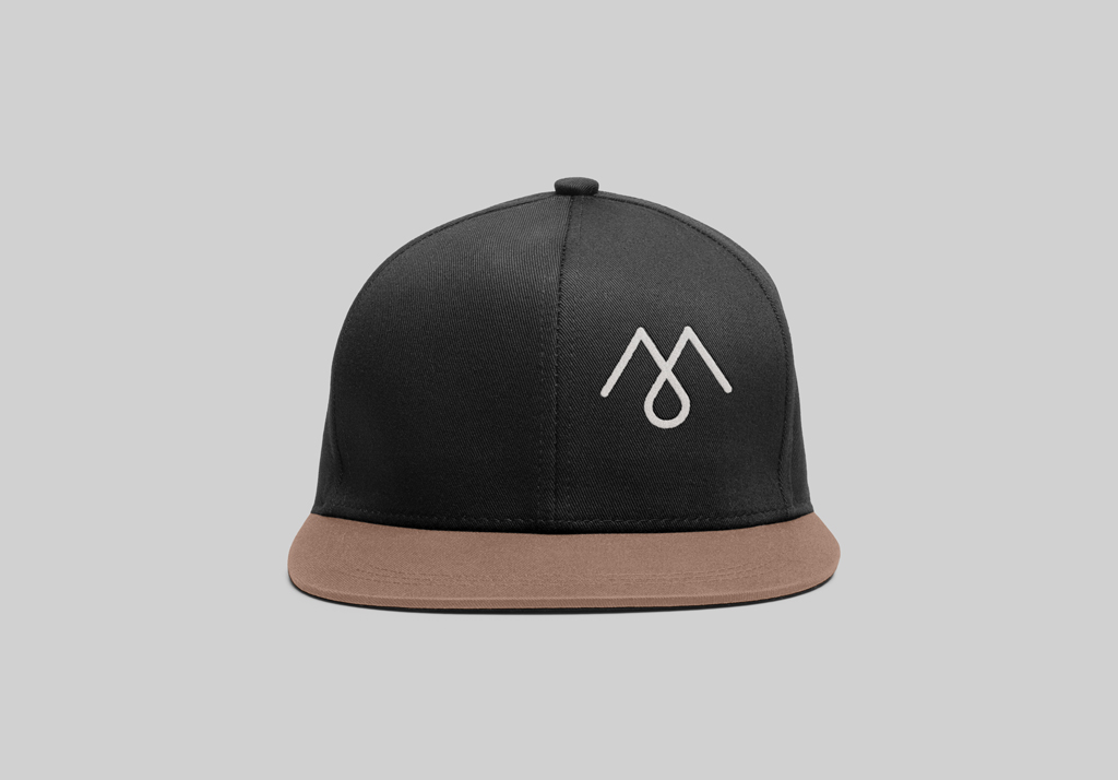
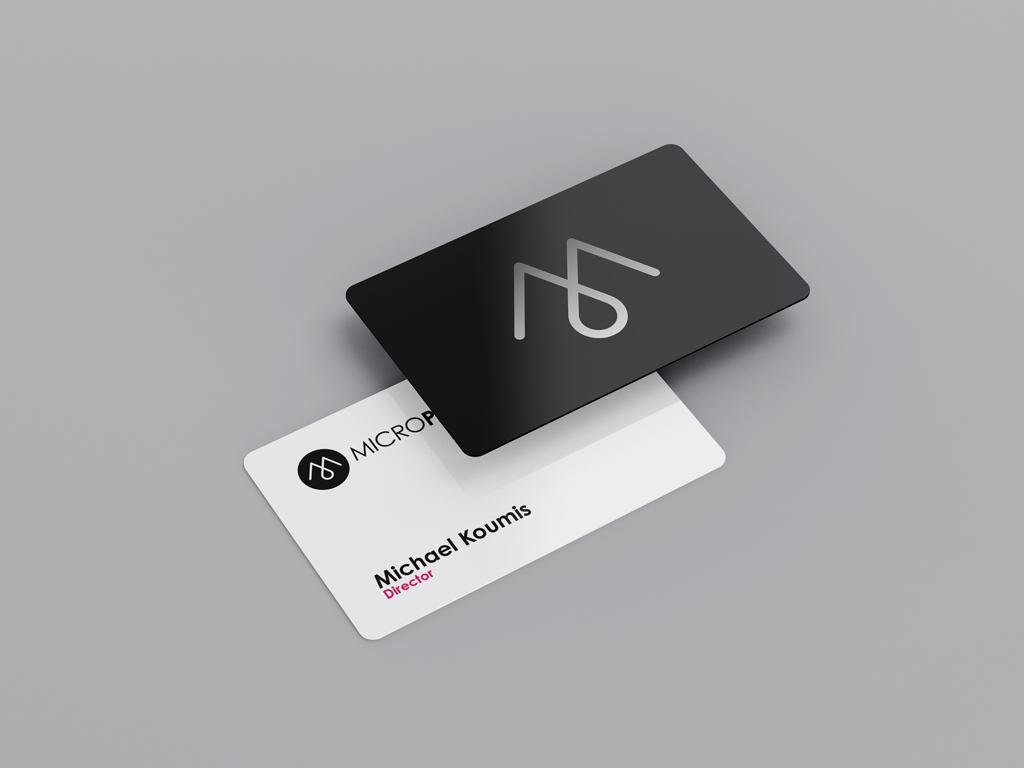
- The Visual Mark: We developed the "M-Drop" icon, a distinctive mark born from the shared element of the industries: pigment. It interlinks two ink drops to form both an 'M' and a droplet in the negative space, signifying innovation and realism.
- Typography: We utilied Century Gothic Pro, a geometric sans-serif that provides a friendly yet structured aesthetic across all brand executions.
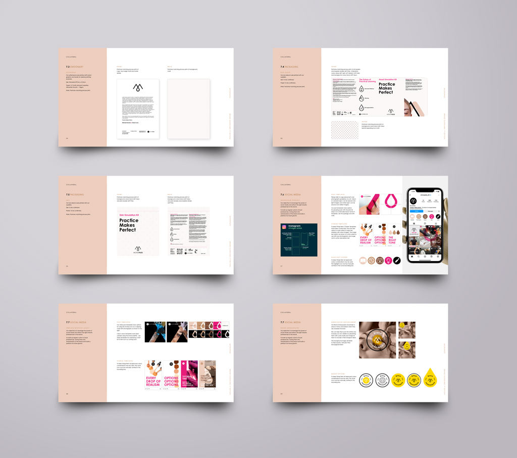
- Colour Palette: The identity is built on a sophisticated palette of Black, MP Dark, MP Medium, and MP Light skin tones, accented by MP Pink for energy and outcome-driven focus.
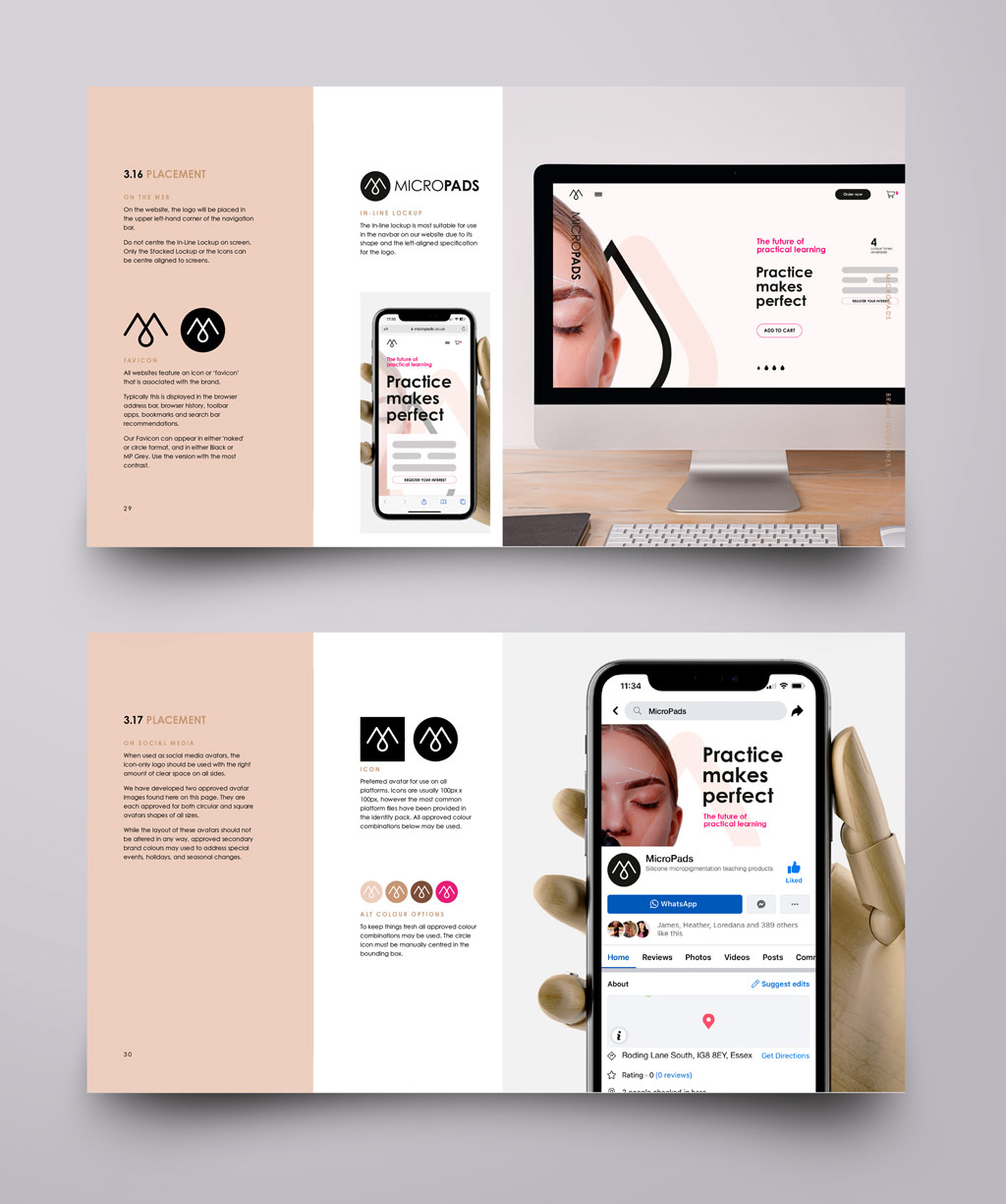
- Omnichannel Experience: We implemented a resilient identity system that scales from tiny website icons to large-format professional merchandise and eco-friendly packaging.
The Results
The result is a brand identity that successfully transitions practitioners from users to ambassadors.
- Alignment: The external brand now matches the innovative reality of the products, ensuring that "Practice Makes Perfect" is a promise reflected in every touchpoint.
- Confidence: By utilising high-end marketing and realistic visual prompts, the brand has established instant credibility among experienced technicians and beauty academy owners.
- Market Standing: MicroPads is now positioned as the definitive leader in realistic training aids, uniquely capable of helping practitioners "find their happy" while growing in skill and confidence.
"Clark&Waugh have an exceptional talent for branding design! Their work on our new startup brand identity was nothing short of outstanding. Our vision was captured perfectly, creating a brand that truly represents our values and mission. Their creativity, attention to detail, and dedication to delivering excellence shine through in the work. We're thrilled with the results, and working with them was an absolute pleasure!"
Michael Koumis & Paolo Scura
Co-Founders


Have a project in mind?
Thank you! Your submission has been received!
Oops! Something went wrong while submitting the form.