


hello@clarkandwaugh.com
IMI Solutions
IMI Solutions engaged us to redefine their strategic foundation and visual identity. Our goal was to bridge the gap between customer perception and technical reality, ensuring the brand accurately reflects their position as IT infrastructure specialists delivering high-integrity, solution-orientated service.
Region
ANZ (Australia & New Zealand)
Scope
Strategy | Identity | Print & Digital Branding | Website
Timeline
14 Weeks
Live project
Preview

Defining a Tier-One Identity
IMI Solutions is an IT infrastructure specialist delivering tailored, high-integrity solutions designed to power business growth operating out of Sydney and Melbourne. While the business had undergone a "full renovation" in its internal capabilities, shifting from simple execution to high-level advisory, its external presence remained stuck in the past. We were engaged to redefine their strategic foundation and visual identity to ensure their "front door" accurately reflected the sophisticated, solution-oriented partner they had become.
The Challenge
For years, a significant gap existed between what IMI did and how it was perceived in a saturated market. Clients often saw only the specific technical service they were using, remaining unaware of the full breadth of IMI's expertise. As John Jordan, Client Service Director, noted, the old brand was "fit for purpose at the time," but it failed to communicate the company’s ability to "cut through complexity" and offer advice rather than just execution. The challenge was to move IMI from being a "best-kept secret" to a visible, enterprise-grade partner that builds instant trust with CEOs and procurement managers.
Our Strategic Approach
Our methodology focused on creating a "magic thread" to link all touchpoints, establishing a unique signature that differentiates IMI from its competitors. The core of the strategic goal was to balance deep technical expertise with a clear, human approach, making complex technology feel both understandable and reassuring. By shifting the brand conversation from a reactive "Tell us what you need" to a proactive "What are you trying to achieve?", we highlighted IMI’s essential role in shaping solutions and reducing risk early in the project lifecycle. This repositioning ensures the brand reflects a partner who is capable of delivering long-term value through consistent delivery and unwavering integrity.
The Solution
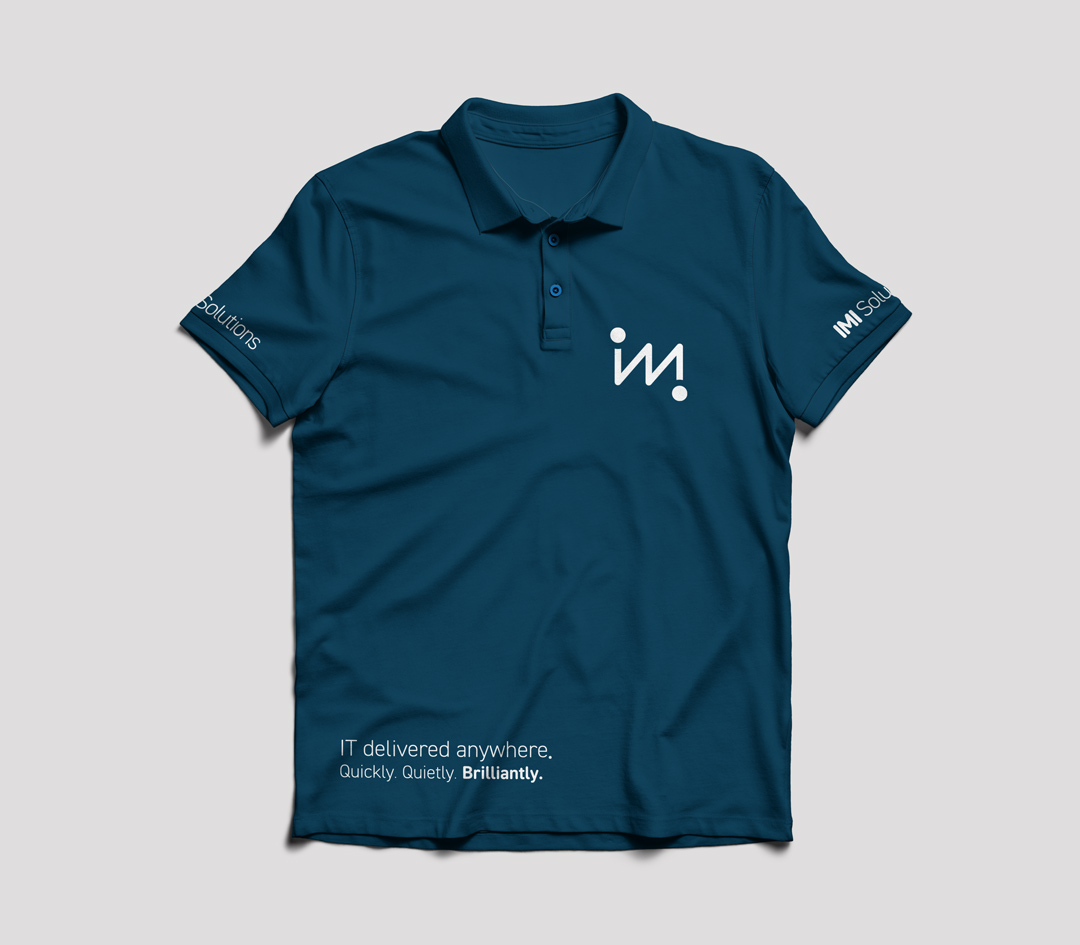
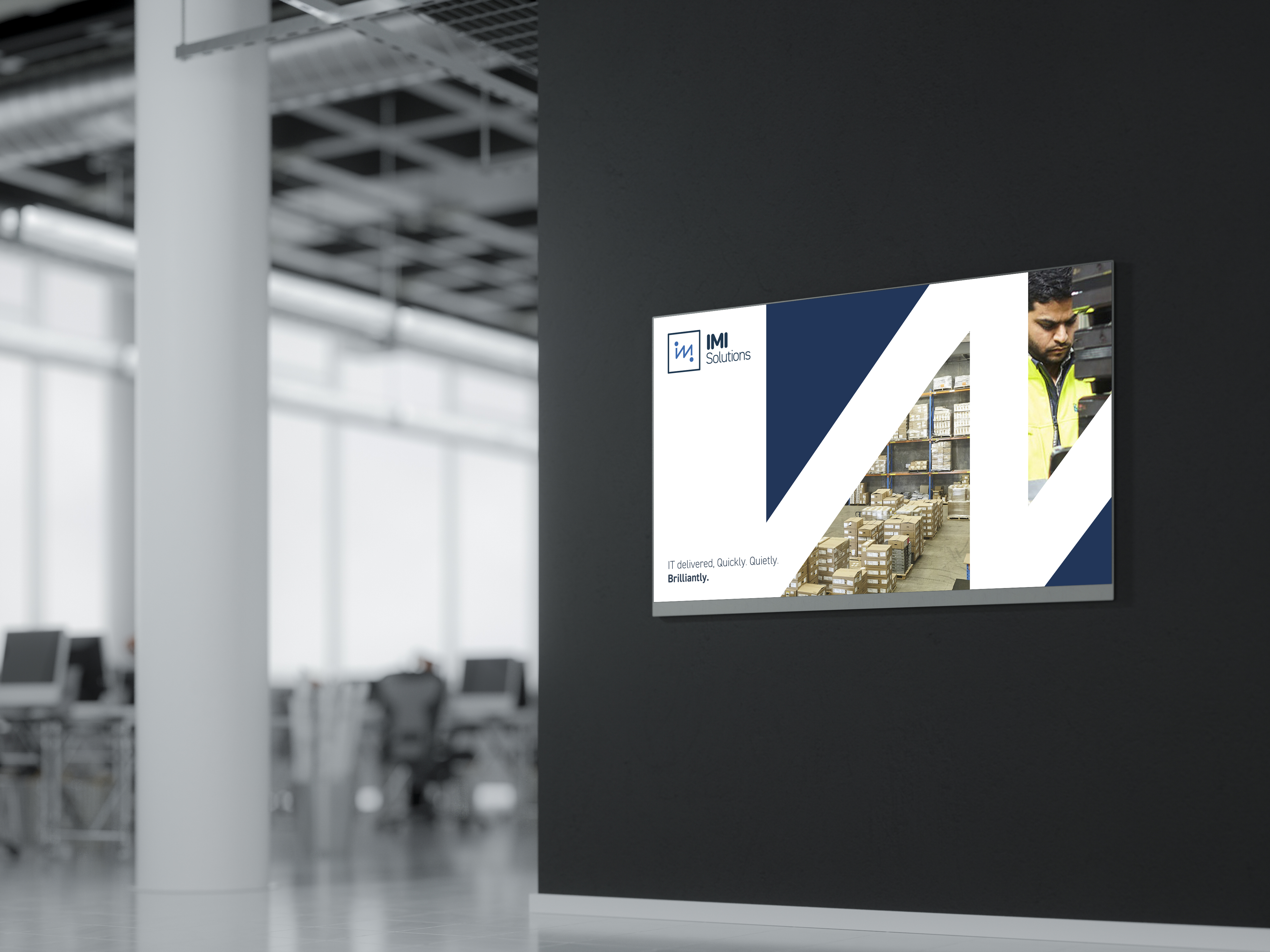
We crafted a modern, dynamic identity that reflects energy, momentum, and a forward-looking business.
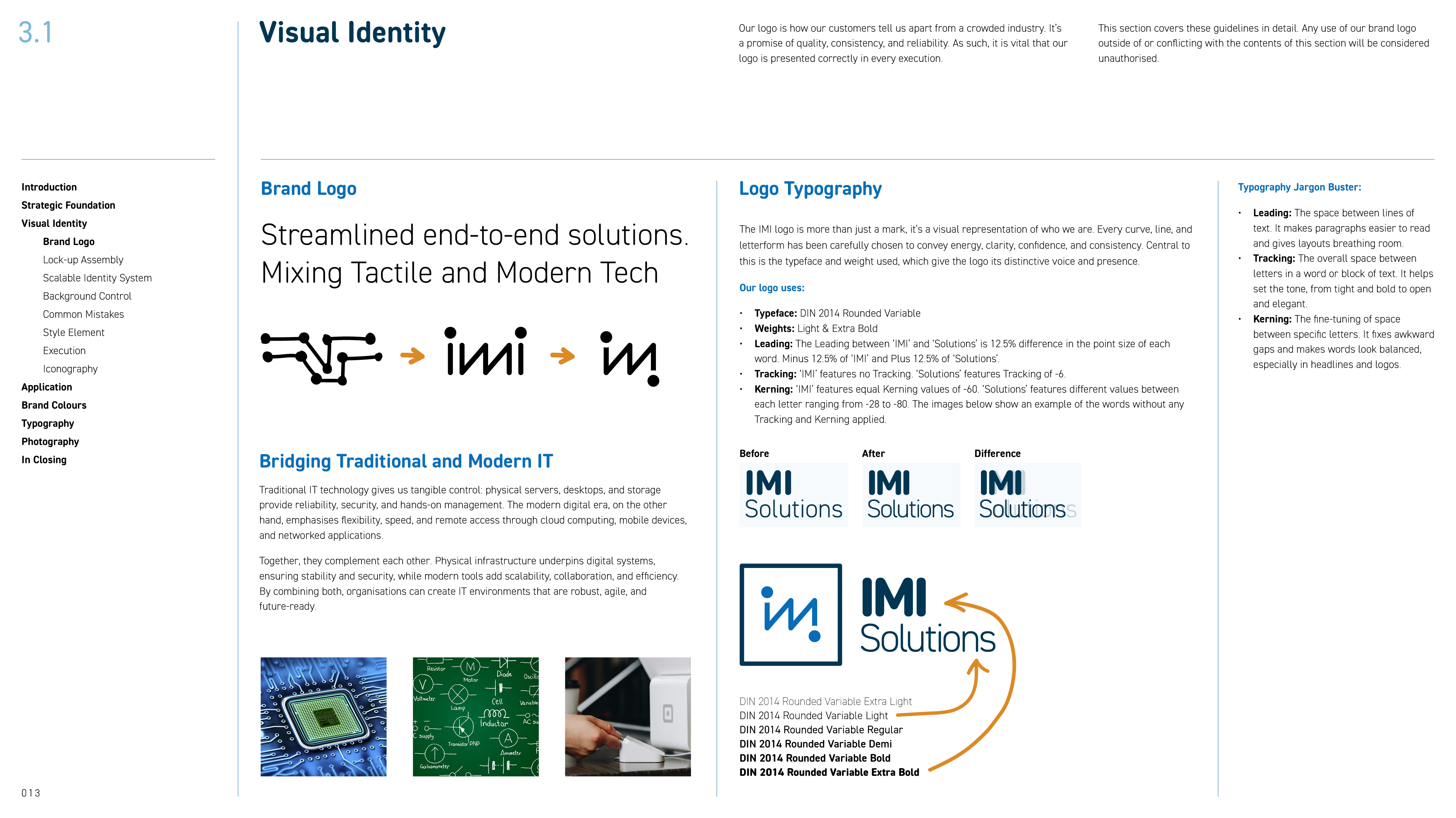
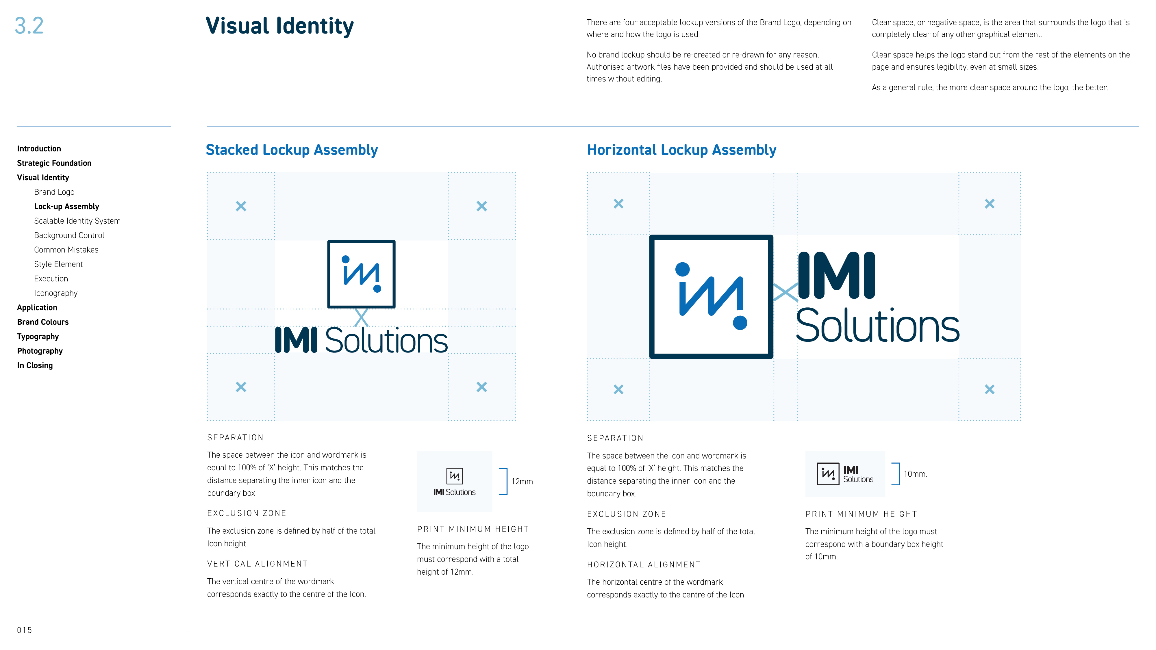
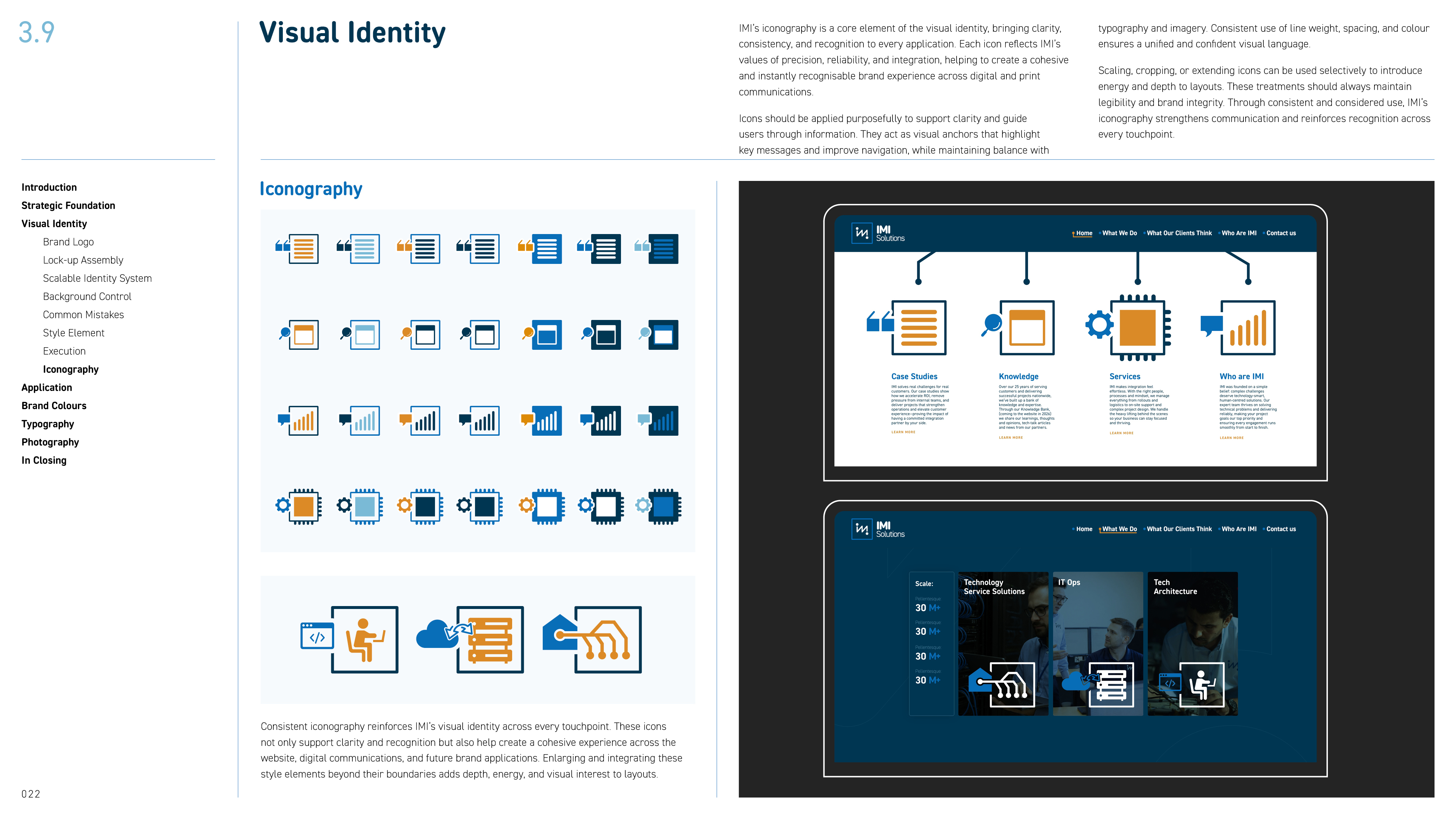
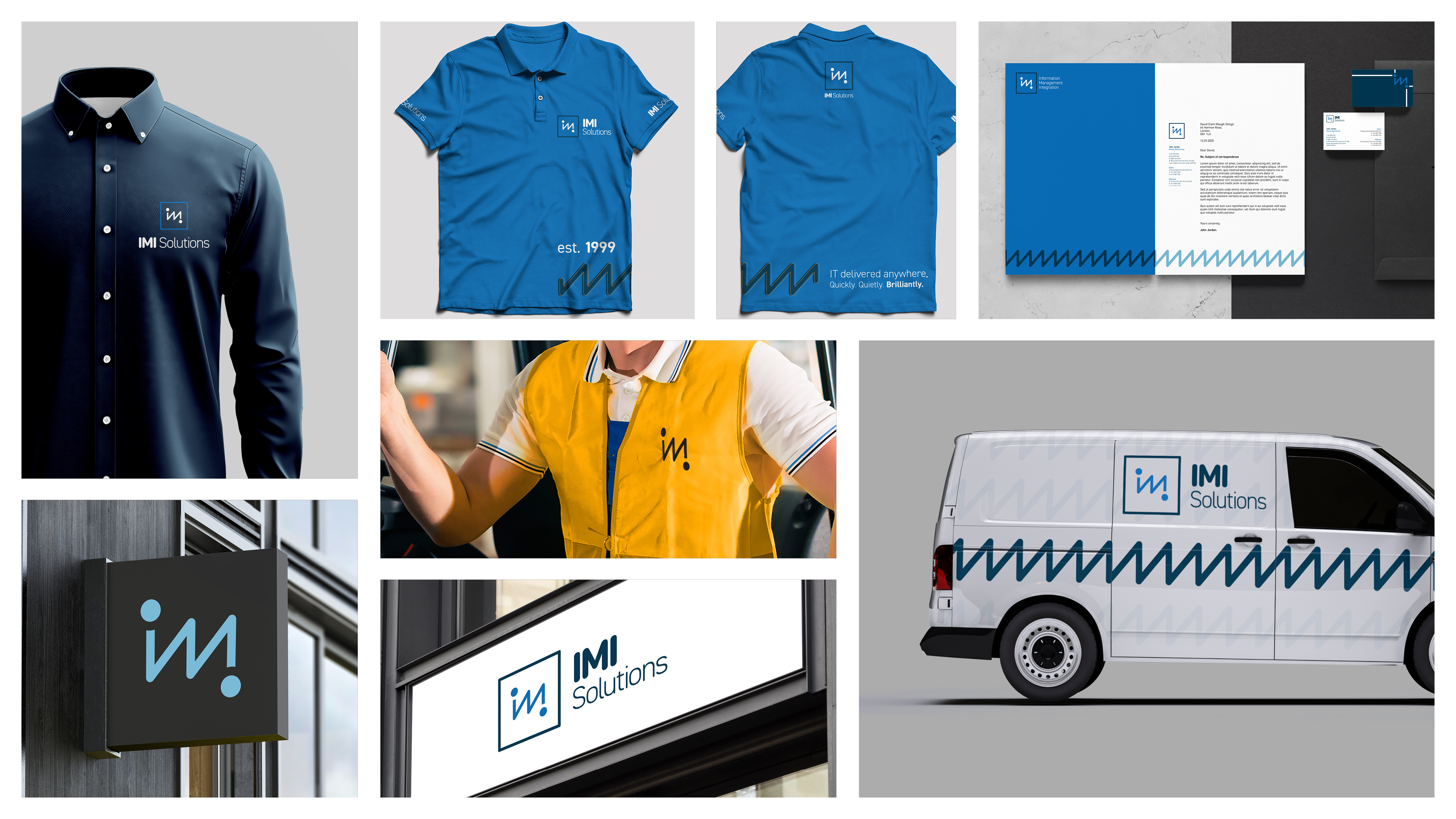
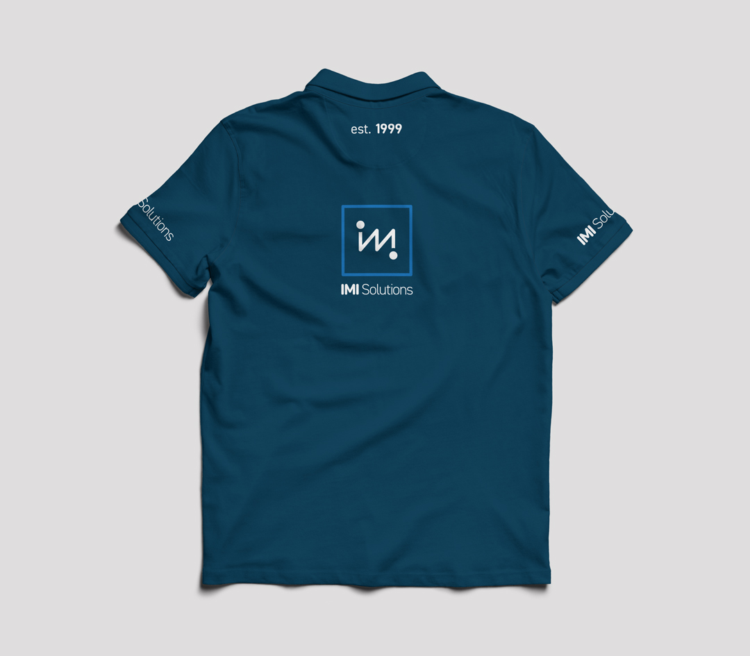
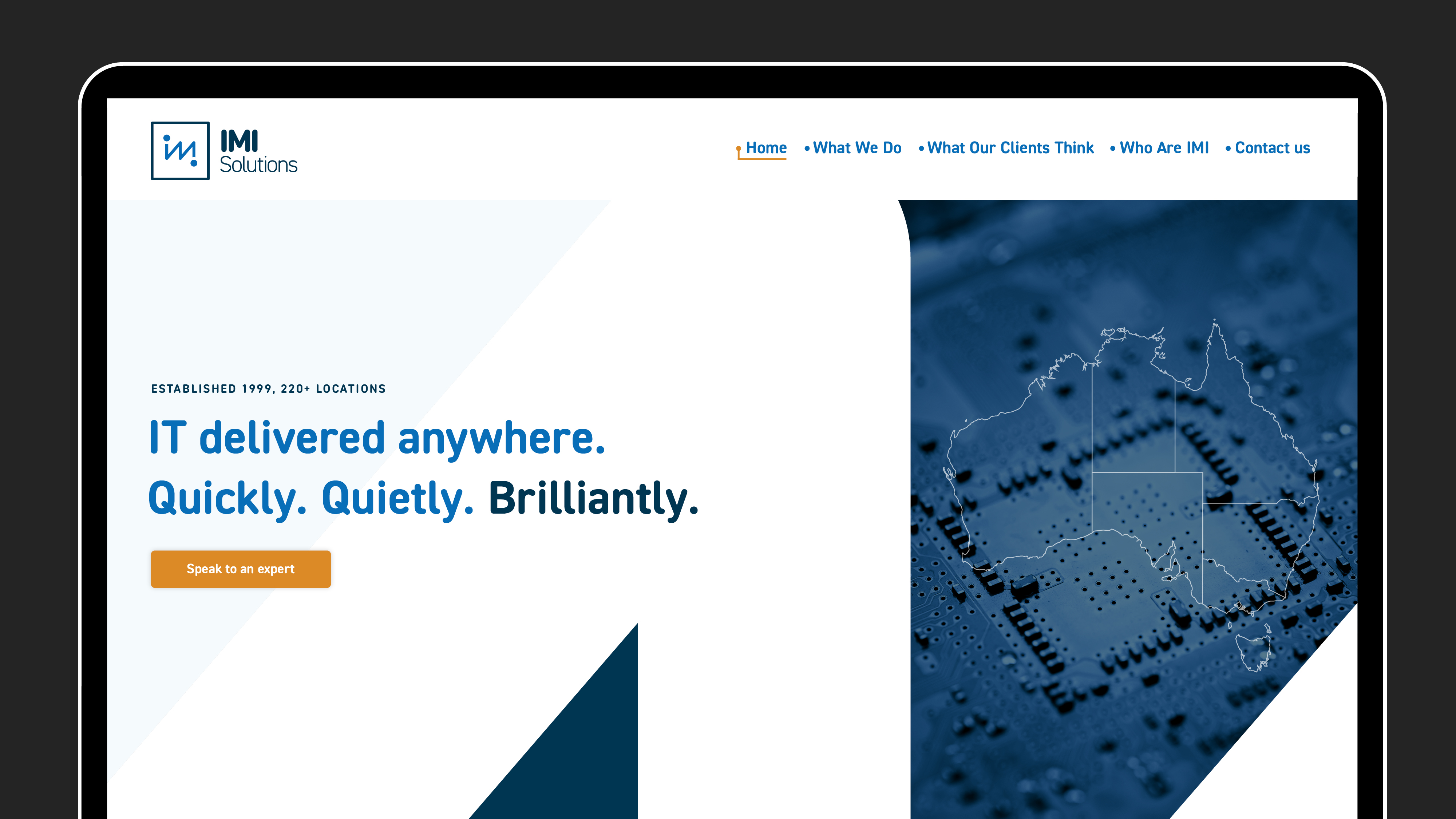
- The Visual Mark: We developed a logo mark inspired by a data board combined with the "IMI" initials, signifying an uninterrupted and dynamic flow of information.
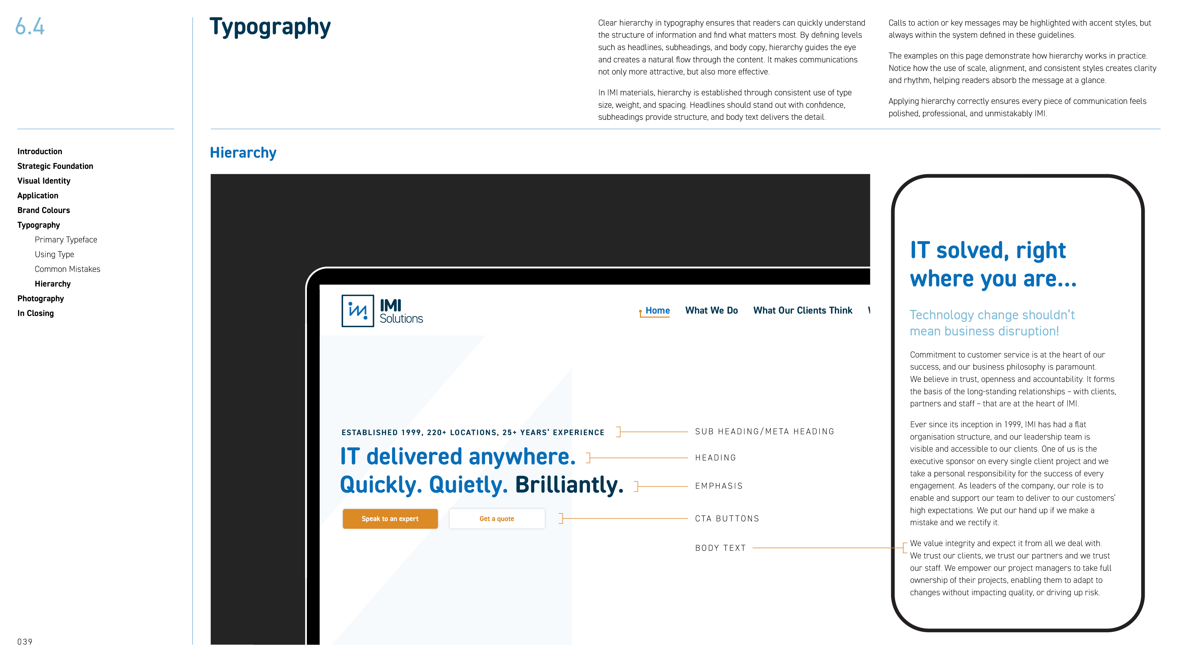
- Typography: We selected DIN 2014 Rounded Variable as the primary typeface. Its clean geometry suggests technical precision, while the rounded details add a layer of warmth and approachability.
- Color Palette: We utilised a core palette of Blue (#086eb8) and Dark Blue (#003652) for authority, accented by Sky Blue (#79bbd7) and Orange (#db8a28) to inject energy and highlight key outcomes.
- Scalable System: We implemented a resilient identity system that adapts seamlessly across digital interfaces, print branding, and physical apparel.
The Results
The result is an identity that no longer feels "aspirational" but shows IMI as they truly are: a Tier-One partner.
- Alignment: The brand now matches the reality of IMI’s capabilities, providing a clear and accurate first impression for new leads.
- Confidence: By emphasising "IT Delivered, Quickly. Quietly. Brilliantly!", the brand inspires trust through consistent delivery and unwavering integrity.
- Market Standing: The "fully renovated" brand identity accelerates the sales cycle by reducing buyer hesitation and positioning IMI as a steady, long-term partner for complex infrastructure challenges.
"Working with them has been fantastic, highly valued and appreciated. We're an Australian company, i've been telling everyone how small the world is and how we can leverage partners like Clark&Waugh to bring in new perspectives."
John Jordan
Client Services Director, IMI Solutions
Have a project in mind?
Thank you! Your submission has been received!
Oops! Something went wrong while submitting the form.