


.jpg)


hello@clarkandwaugh.com
Regel
Regel is a specialist provider of modern electrical and renewable energy services, founded on the commitment to methodical practice and future-proof technology.

A General Principle for Modern Electrical Services
The business was established to bridge the gap between high-tech electrical solutions and a customer experience rooted in absolute safety and ease. We were engaged to build a stable visual platform and a principled tone of voice that would serve as the foundation for the company’s growth in the renewable energy sector.

The Challenge
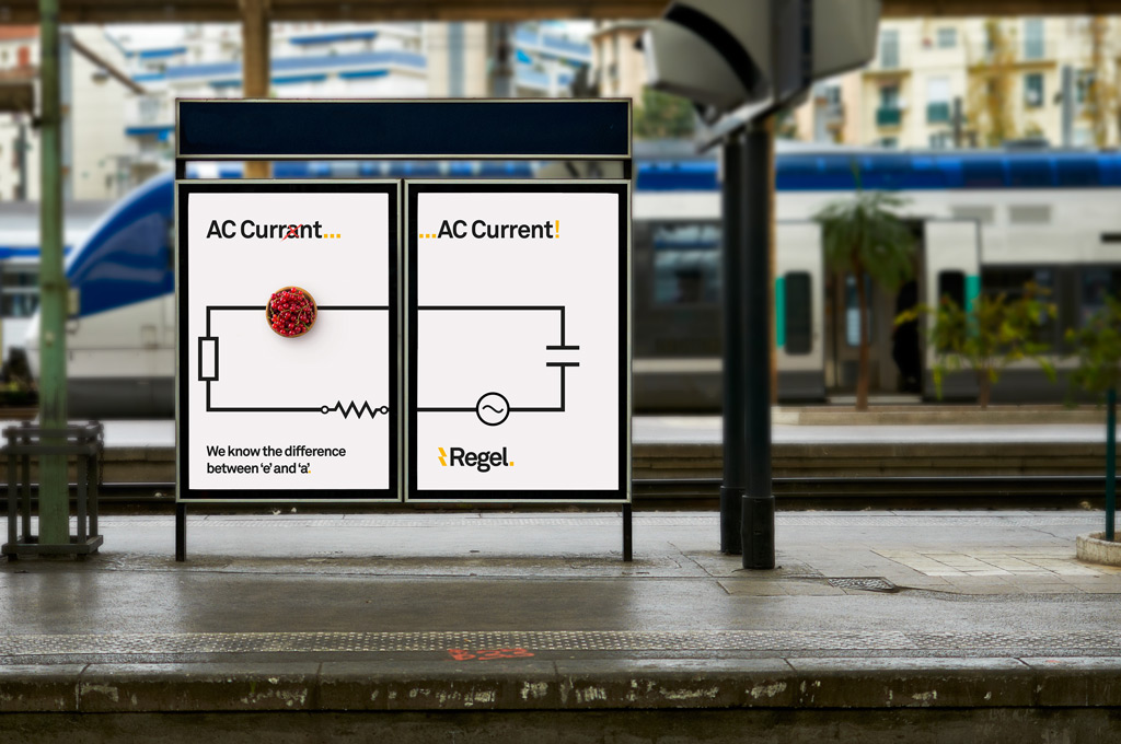
The electrical services market is often perceived through a lens of high price and varying quality, making it difficult for a premium provider to establish immediate trust. Regel faced a specific dual challenge: they needed to separate themselves visually from "typical" competitors while addressing a naming ambiguitymost potential clients assumed the brand name was a misspelling. The objective was to transform this perceived weakness into a position of strength, establishing Regel as a knowledgeable, thorough authority that priorities safety over shortcuts.
Our Strategic Approach
Our methodology centered on the concept of "The Rule of Practice". We proposed a strategic pivot by leaning into the dictionary definition of the brand name: rule [noun] what usually happens or is done; a general principle. By framing the name as a brand promise instead of what was being perceived as a spelling error, we established a "methodical" tone of voice designed to put clients at ease. This approach targeted homeowners looking to increase pride in their properties through high-tech, future-proof, and modern renewable capabilities, ensuring that Regel’s professional attitude spoke for itself.
The Solution
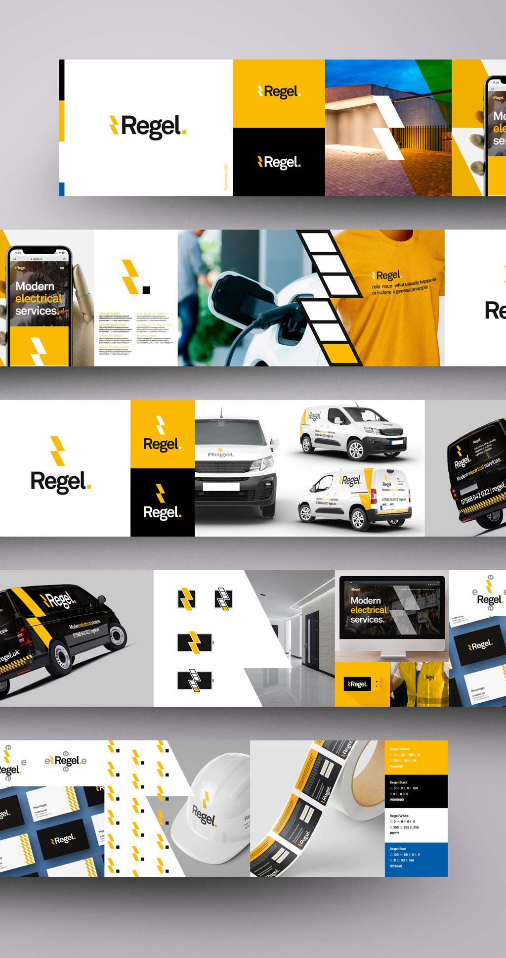
We crafted a visual identity that utilises subconscious prompts to signal electrical authority and industry-standard safety.
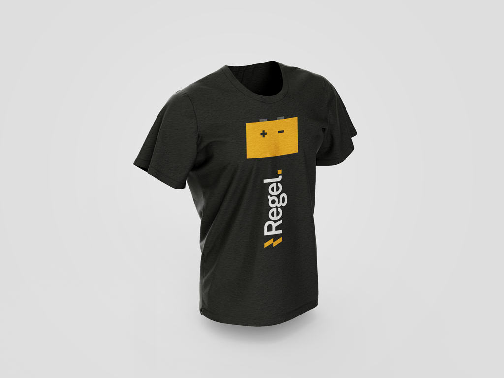
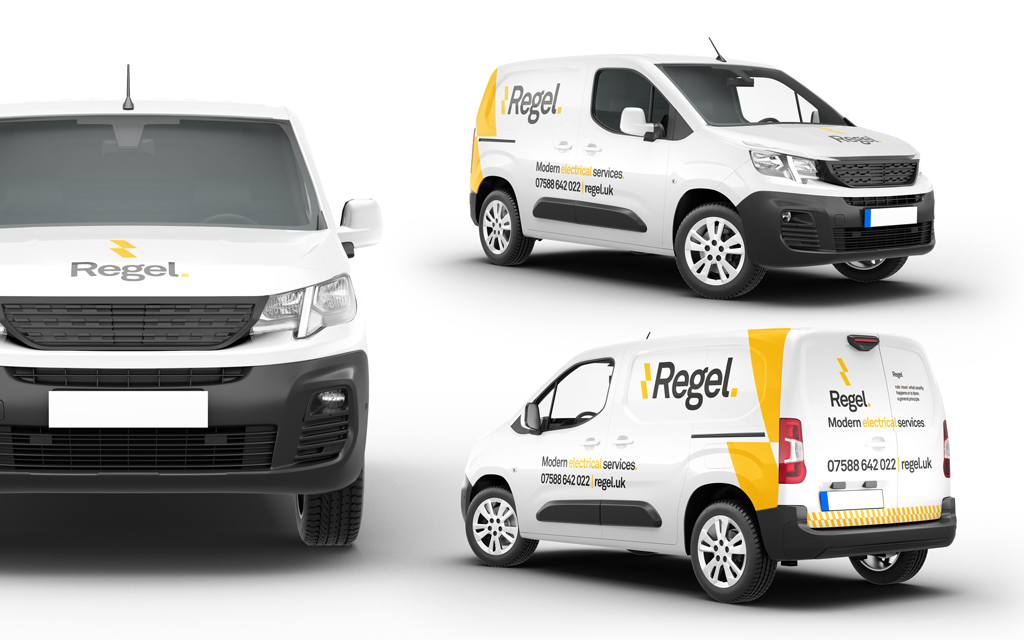
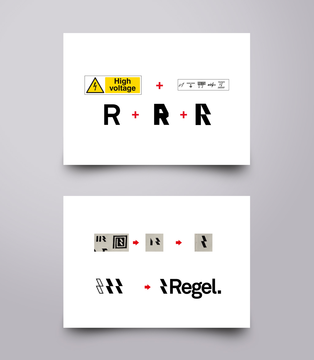
- The Visual Mark: We stripped the iconography down to base elements and simple geometric shapes to evoke the concept of raw power handled with precision.
- Typography: The brand utilizes a clean, structured typographic system that echoes the "Rule" narrative, maintaining a professional and knowledgeable aesthetic.
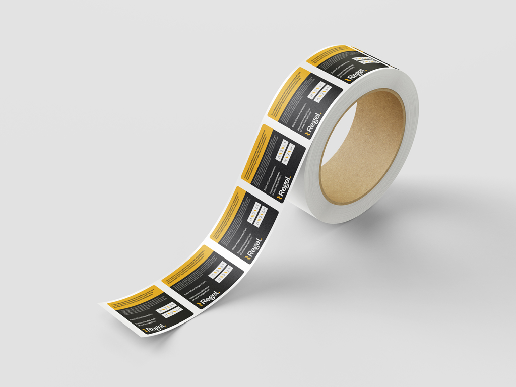
- Color Palette: We implemented a palette of Regel Black (#000000), Regel White, and a technical Regel Blue—colors synonymous with electrical safety and industry oversight.
- Brand Ownership: We used humor and direct definitions across brand touchpoints to address the name directly, turning the branding into a memorable point of engagement.
The Results
The resulting identity positions Regel at the intersection of high quality and modern vision.
- Alignment: The brand now reflects a business that "plans, prepares, and executes" with a thorough tone, successfully attracting clients who trust their rigorous process.
- Confidence: By using a visual language familiar to the safety aspects of the industry, Regel provides a subconscious prompt of reliability, putting potential customers at ease from the first interaction.
- Market Standing: Regel is now positioned as a high-quality, professional alternative to generic competitors, identified as a proactive leader in future-proof renewable energy services.

"Clarkl&Waugh have been a pleasure to work with whilst they re-branded the business and set about creating an online presence for us. Their structured way of progressing through the design stages was very simple and effective. Paired with their knowledge of what was needed from us to make the profile a success, They worked with us step-by-step to create something that works for us. All in all I’m very happy with the vision and brand they created for Regel. With a concrete base for the business now set, It's a platform that can now be built on.."
Rhys Knight
Director

Have a project in mind?
Thank you! Your submission has been received!
Oops! Something went wrong while submitting the form.